Logos are more than just mere symbols; they are the embodiment of a brand’s identity, ethos, and history. Over time, as brands evolve and reinvent themselves, their logos often undergo transformations too.
Ready to test your brand-savvy brain? Let’s take a nostalgic trip back in time! Can you guess the brand from its original logo? No spoilers, but let’s just say some of these might just surprise you! Game on!”
Image Credit: Depositphotos.com.
Logo 1

Hint: You’re likely viewing this on a product from this company.
Image Credit: Wikipedia.
Apple Inc.

Apple’s logo journey began with a detailed illustration of Sir Isaac Newton under an apple tree, designed by co-founder Ron Wayne in 1976. This intricate design was quickly replaced in 1977 by the iconic bitten apple, crafted by Rob Janoff. The bite was added to clarify it’s an apple, not a tomato or cherry, but it also cleverly alluded to the computer term “byte.”
Image Credit: DepositPhotos.com.
Logo 2
![]()
Hint: Nobody uses it anymore.
Image Credit: Wikipedia.
Mozilla Firefox
The Firefox logo has a vibrant history that mirrors its evolution in the tech world. Originally, the web browser was named “Phoenix,” symbolizing rebirth from the ashes of Netscape Navigator after its decline due to Microsoft’s Internet Explorer. Fittingly, the first logo depicted a Phoenix bird. However, due to trademark disputes, the browser’s name was changed to “Firebird”, but another naming conflict ensued. Finally, in 2003, the browser was renamed “Firefox,” and the logo was updated to the fiery fox encircling a stylized earth. This iconic design, capturing speed and global reach, has seen refinements over the years but has consistently maintained its original essence.
Image Credit: Wikipedia.
Logo 3

Hint: It used to have a different name.
Image Credit: ibm.com.
IBM
![]()
IBM’s visual branding history traces back to its predecessor, the International Time Recording Company (ITR). ITR’s initial logo was quite ornate, reflecting the prevalent design aesthetics of the early 20th century. However, as the company evolved and became the International Business Machines (IBM) in 1924, its branding underwent a shift. The emblem adopted a globe to reflect its global aspirations. By 1947, IBM transitioned to plain block letters, shedding the globe design. The significant modern makeover happened in 1972 when famed designer Paul Rand incorporated the distinct horizontal stripes. These stripes projected a sense of movement and evolution, aptly capturing the momentum of the technological age.
Image Credit: IBM.
Logo 4

Hint: It recently got super expensive.
Image Credit: shell.com.
Shell

The Shell logo, representing one of the world’s most recognized energy companies, has undergone significant evolution since its inception. Initially, in the 1900s, the emblem featured a realistic Pecten or scallop shell. This was a simple visual play on the company’s name. However, as Shell expanded globally, the need for a more distinctive and recognizable brand arose. By the 1970s, the emblem transformed into the bold, red and yellow design we associate with Shell today, streamlined for visual impact. This iconic symbol reflects not only the company’s rich history but its ability to adapt and remain relevant throughout the decades.
Image Credit: Depositphotos.com.
Logo 5
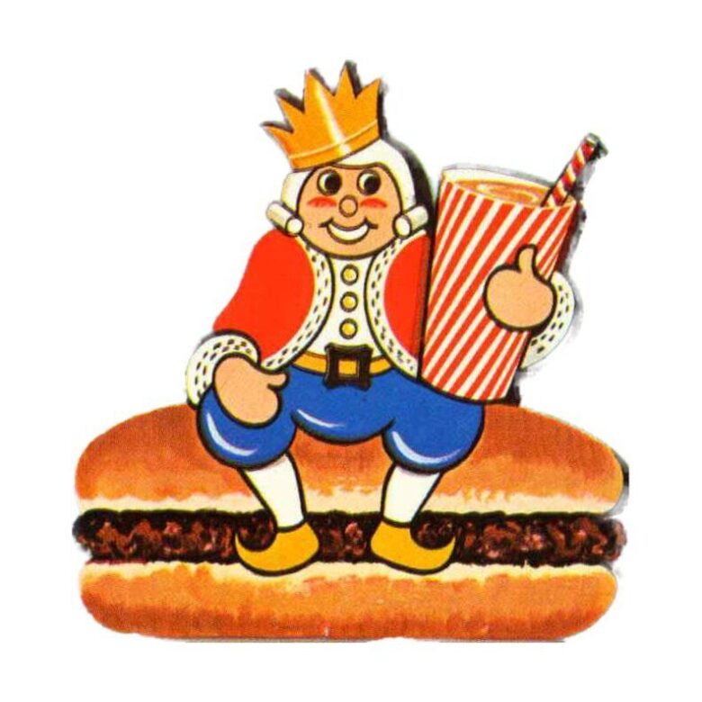
Hint: It goes best with fries.
Image Credit: thebkbook.com.
Burger King
The Burger King logo has seen various changes since the fast-food chain’s foundation in 1953. Initially, the brand started with a king sitting on a burger. However, the logo most people are familiar with, showcasing the bun halves with the brand name in between, was introduced in the 1960s. This design underwent slight alterations over the decades, with changes in color schemes, font tweaks, and layout adjustments. In 2021, Burger King unveiled a retro-inspired logo, harking back to its classic design from the 60s and 70s. This redesign is a nod to the brand’s storied history while also presenting a modern appeal.
Image Credit: DepositPhotos.com.
Logo 6

Hint: You cannot get enough of this brand’s cookies and candies.
Image Credit: nestle.com.
Nestlé

The Nestlé logo has its roots in the family name of the company’s founder, Henri Nestlé. Henri derived the brand name from his surname, which means ‘little nest’ in German. Accordingly, the logo began as a simple representation of a bird’s nest with a mother bird feeding her two young ones, symbolizing care, nourishment, and a strong parent-child relationship. The basic concept of the nest has remained consistent since its inception in the 1860s. Over the years, the design has been subtly refined and streamlined. Today, while the logo retains its iconic nest imagery, the modern version is simplified, offering a more contemporary and global appeal. The Nestlé logo stands as a testament to the brand’s commitment to nutrition and care for over a century and a half.
Image Credit: Nestle.
Logo 7

Hint: You probably own one.
Image Credit: Wikimedia Commons.
Canon

The Canon logo is a classic example of how a brand can evolve while retaining its core identity. Canon began in 1934 as “Kwanon,” named after the Buddhist goddess of mercy. The first logo depicted the goddess with 1,000 arms and flames. As the company aimed to expand globally, they transitioned to the simpler, more universally-recognizable “Canon” to resonate with a global audience. In 1956, Canon adopted the logo we’re familiar with today: the clean, bold red typography.
This article was produced and syndicated by MediaFeed.
Image Credit: Depositphotos.com.
More From MediaFeed

These vintage ad jingles still totally slap today
https://www.msn.com/en-us/money/companies/these-vintage-ad-jingles-still-totally-slap-today/ss-AA1fCKce
- Rare photos of Bonnie & Clyde reveal the love between America’s most notorious criminal couple
- 10 of the wildest UFO stories we’ve ever heard
Like MediaFeed’s content? Be sure to follow us.
Image Credit: IMDb.