

Dashboard design trends from the ’80s that aged like milk
Every design era makes choices that feel cutting-edge in the moment and slightly embarrassing a decade later. The 1980s produced an unusually large batch of dashboard trends chasing a futuristic look that mostly just aged into a punchline.
Here are some of the most forgettable ones.

Fake wood, a full decade past its expiration
American manufacturers kept wrapping dashboards in plastic wood grain well into the 1980s, even after European and Japanese automakers had already moved toward simpler designs to cut down on glare. Real wood ages gracefully. This didn’t. Instead, it faded, cracked, and peeled.

Digital LED speedometers looked incredible for about two years
Bright red or green numbers gave a dashboard genuine sci-fi credibility the day it left the lot. The honeymoon ended fast: drivers found the readouts harder to parse at a glance than a simple needle ever was, and the electronics behind them failed far more often than the analog gauges they’d replaced.
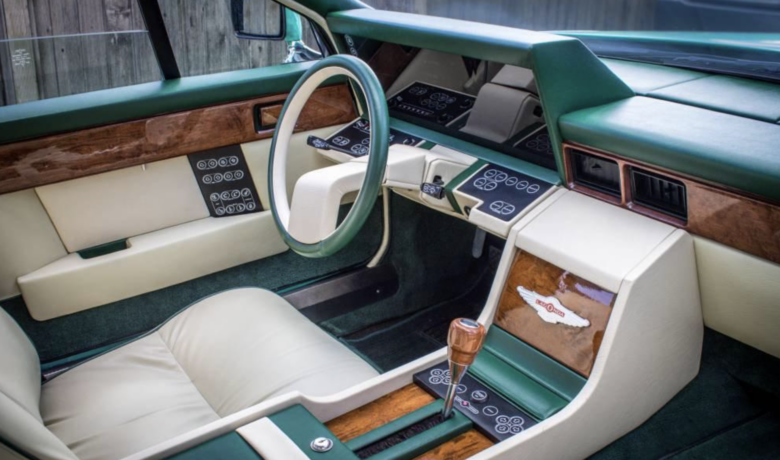
Membrane switch panels
Flat, touch-sensitive, unmistakably futuristic in a showroom. Within a few years, owners reported cheap plastic cracking and buttons going unresponsive one by one, turning a sleek interior into a dashboard nobody could operate.

Cars started talking, whether that was a good idea or not
A synthesized voice announcing “door is ajar” spread fast across manufacturers chasing a genuinely futuristic idea with technology that wasn’t quite there yet. Even a struggling British automaker jumped in, adding a full voice synthesizer to enunciate warning messages on an otherwise unremarkable car.
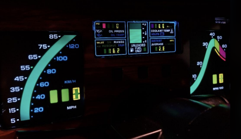
Rainbow tachometer bands promised performance and mostly delivered a sticker
Color-coded RPM zones looked aggressive on the dash of a perfectly ordinary sedan. Design retrospectives later called most of them more style than substance, rarely tied to anything the engine was actually doing differently at those RPMs.

Plastic chrome and faux marble tried to say luxury, but said something else entirely
American luxury brands leaned hard into shiny plastic trim and marbled paneling all decade long, a combination one retrospective summed up bluntly as simply not aging well, especially next to the more restrained interiors European and Japanese competitors were already building.

The bottom line
Every trend here chased the exact same feeling: a dashboard that looked like it belonged in the future. Most of them ended up looking like precisely what they were: one decade’s best guess at what came next, guessed just slightly wrong.
Ask us! What questions do you have about content, strategy, pop culture, lifestyle, wellness, history or more? We may use your question in an upcoming article!
Related:
Like MediaFeed’s content? Be sure to follow us.
This article was syndicated by MediaFeed.co.